



The Adoptive Families Association of British Columbia embarked on a journey of rediscovery a few years ago, and wished to embrace a new name, new brand tone of voice and culminating in the creation of a new logo. I was contracted by Affinity Bridge, who was spearheading the project for AFABC, to write for the project. My friend and fellow creative Nancy Wu was hired at the same time to create the brand's new visual identity.
I was advised that the new name & brand needed to be inclusive and reflective of all types of people and families served, easy to remember and pronounce, and easy to implement. So in other words, an 180 degree pivot from "Adoptive Families Association of British Columbia".
One of the first steps was to engage with both AFABC stakeholders, as well as past and current clients. I facilitated a number of group and one-on-one sessions and was able to glean some extremely valuable and helpful information about the Association such as:
1) The name was not reflective about all of the types of families and groups of people that are served 2) it’s too long, people often get it wrong, or shorten it 3) “Association” has a government or ministry sound to it which may unintentionally relate them to those departments rather than reflecting that who we are which is an independent, non-profit organization 4) “Adoption” has a negative connotation among Indigenous communities
One internal stakeholder told me, "When I started, there's this community, but they have a secret language and a lot of acronyms. And, you know, I actually had to have my staff tell me, no, you do belong. And even though you have no idea what we're what we're talking about, you do belong. So I think it's really important to be very, very welcoming, from the beginning."
One particular interview with an external stakeholder provided me with the spark of an idea about what the new name could be. She mentioned that "One of the things that AFABC is about is that they care very, very deeply about their partnerships and friendships and holding each other up walking alongside." and "I think that if you're going to come up with a name, start with your values, doesn't matter. Your values should be informing every single thing you do. Peter, when you look into your heart rather than Google, good stuff will start coming out of there."
What I heard, over and over in our stakeholder and member interviews, were the words "warmth, human, connection, real." So a completely abstract name didn't feel right. I tried creating portmanteaus to see if combining two or three key words might work, and again, they felt artificial. One of the first of potential new names I wrote down after these interviews was "Belonging". Dozens of other names were presented internally, but "Belonging" was the one I championed, was Nancy's favourite as well, and soon became the preferred option of our AFABC client as well. I also created guidelines as to what the new brand should sound like.
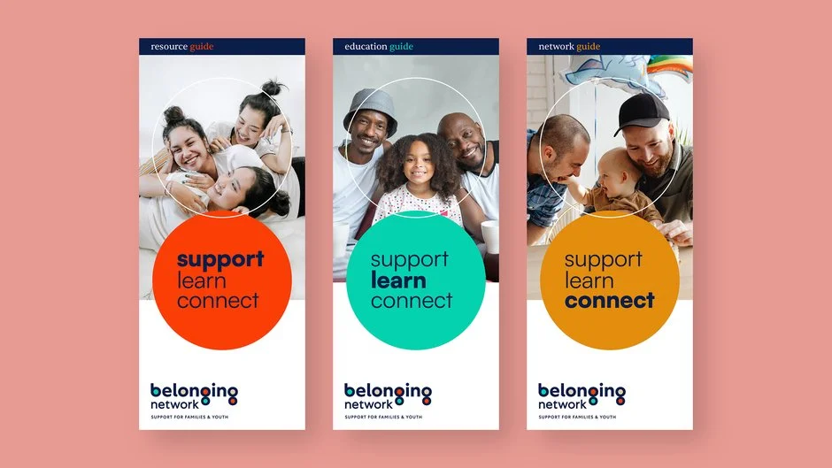
Unfortunately, due to the demands of an incoming project, I had to step away from continuing with the naming process, but was absolutely thrilled to learn that "Belonging" still remained AFABC's top choice, and ultimately, "Belonging" developed into "Belonging Network" and Nancy Wu created an absolutely beautiful visual identity, as friendly and approachable as the name "belonging" is itself.
My Contribution: Research, Workshop Facilitation, Name Generation, Brand Tone of Voice
In Collaboration With: Affinity Bridge
Art Director/Designer: Nancy Wu, Nancy Wu Design
For: Belonging Network