


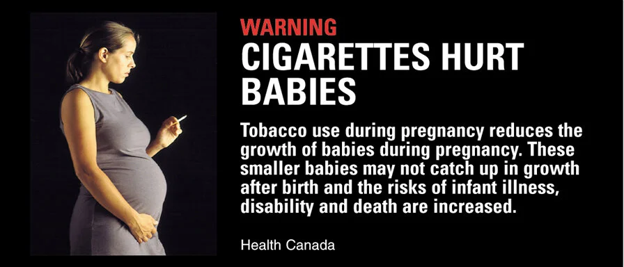


Copywriting of Health Warning Messages on Tobacco Packaging
The Government of Canada, along with partner agencies and NGOs, were able to have a remarkable piece of legislation passed some years ago; it mandated that 35% of the surface area of all tobacco packaging be devoted to health warning messages.
The contract to develop this messaging was awarded to Focus Strategies/DDB. I was hired by Focus as creative director and writer on the project. Together with my co-collaborator, Kaldor Designs, we developed intrusive full-colour warnings that were very graphic in nature. But we were in danger of being perceived as all “bad cop”. So during the development stage, I suggested that rather than just being messengers of doom, we should offer positive reinforcement for smokers, by including quitting tips and sources of help on a slider inserted inside the packs.
The Ontario Cancer Society conducted research on the warnings’ effectiveness. 44% of smokers polled said the new warnings increased their motivation to quit smoking. CNN, BBC and other media outlets have covered this story.
Note: this packaging was praised as a "masterpiece of design" and featured in a Museum of Modern Art exhibition, DESIGN TAKES ON RISK.
P.S. retailers reported that young males refused to purchase the "impotence" packaging.
My Contribution: Concept Development & Copywriting
In Collaboration With: Sally Douglas, Kaldor Design
Agency: DDB Vancouver
For: Health Canada